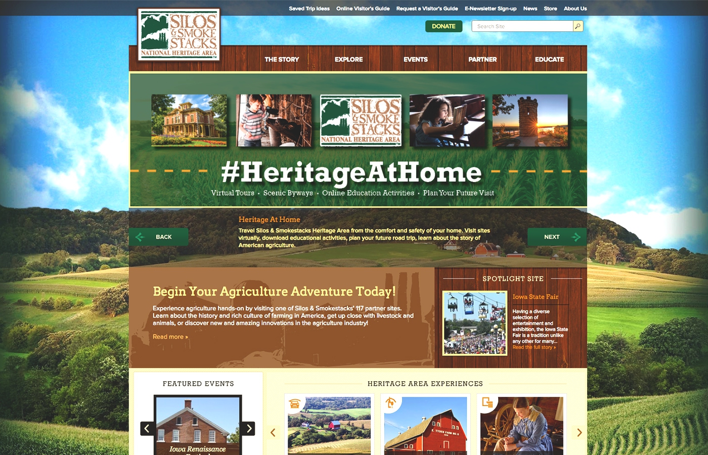

Silos & Smokestacks Heritage
The project was to completely revamp User Experience, redesign and rebuild the front-facing website in CMS, while making it responsive and have a way to easily find specific attraction. The biggest challenge was reorganizing, reducing, and simplifying content and coming up with user-friendly navigation.
Project Role
UI/UX, Moodboards, Web Design, Front-end Development
Tech Stack
HTML5, JS/jQuery, CSS3, Wordpress, PHP
Duration
7 months

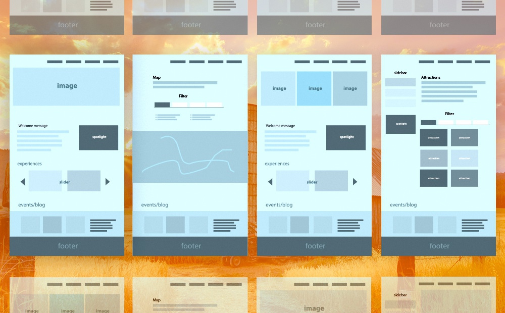
Wireframe Designs
This was a fairly large project because of the pure content for the whole website. Even with clarifying and simplifying old content, I still ended up creating over 15 unique wireframe designs for the templates. The main sections were focused on showing attractions, having individual sub-sections and a way to easily filter by interest and location.
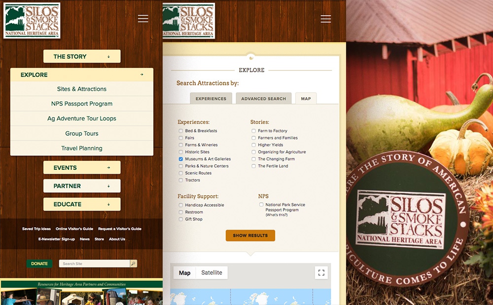
Complex Navigation - Simple Solutions
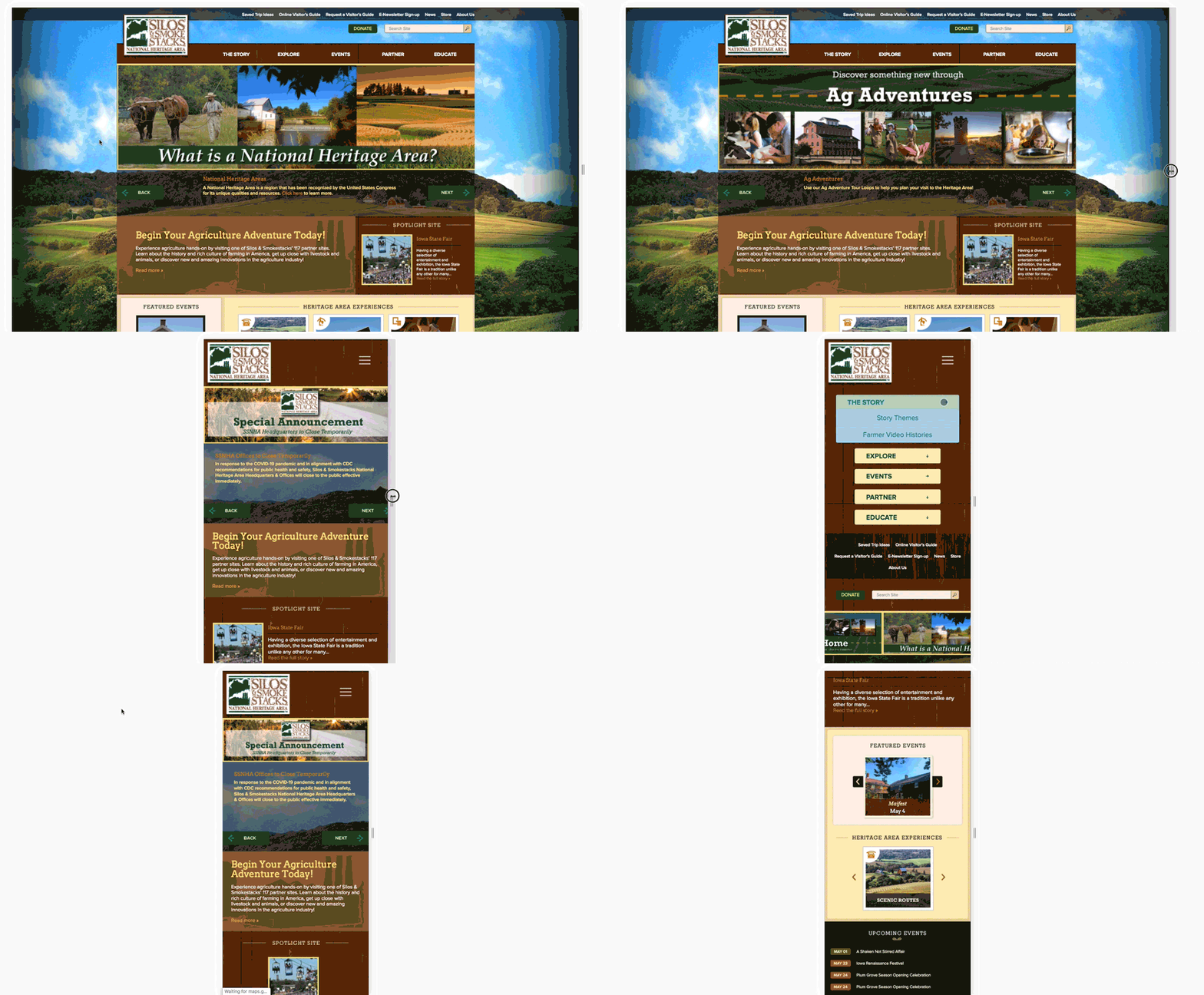
The most important part of the website was to come up with quick way to navigate from the top level and drill down to the next sections without overwhelming the visitors who wanted to plan their trip. I have taken advantage of using collapsing sections, sidebars and filtering while keeping it neat and obvious while guiding the User experience.
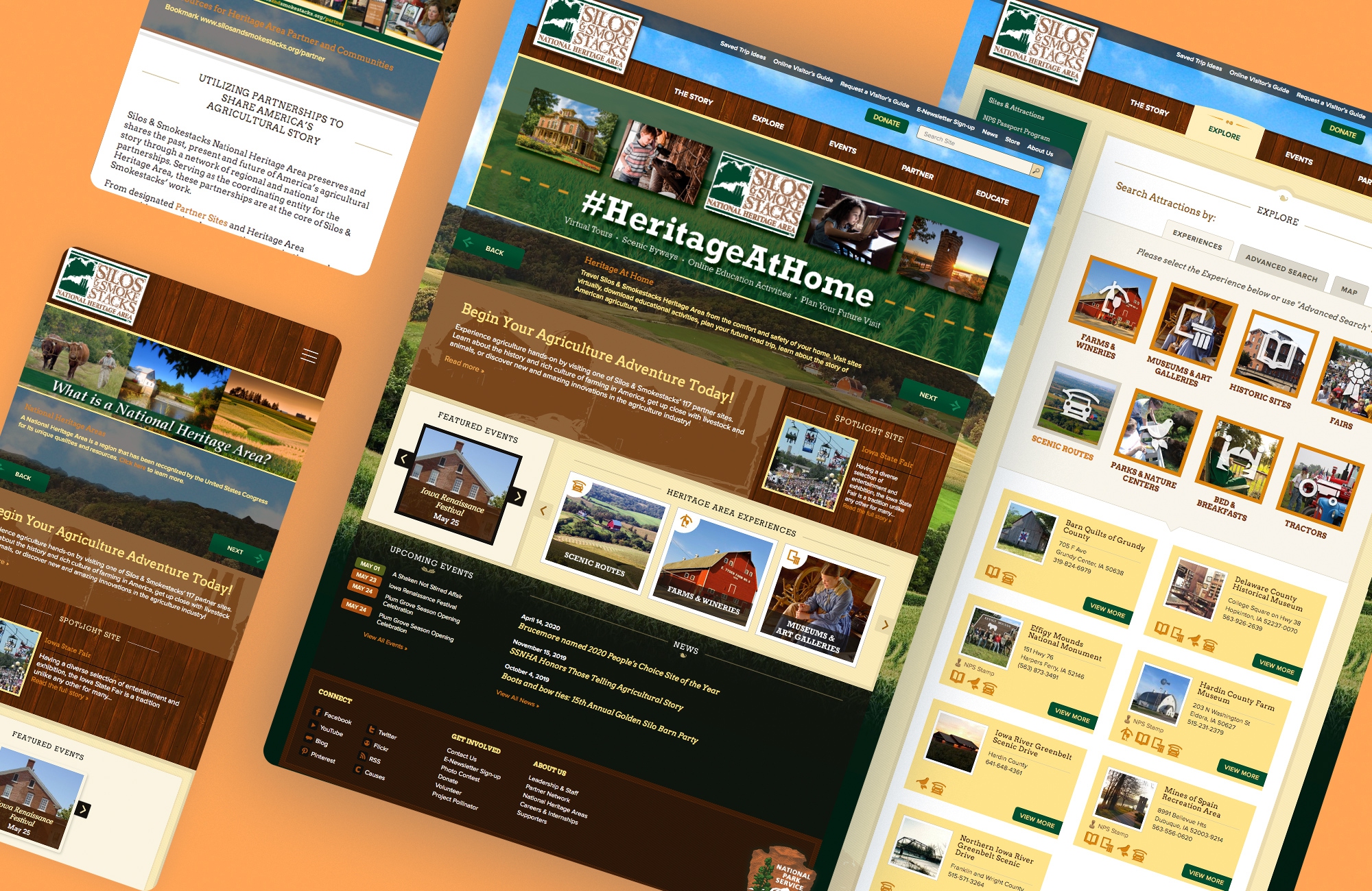
Responsive Design
Our heritage and ideals, our code and standards - the things we live by and teach our children - are preserved or diminished by how freely we exchange ideas and feelings.