
Carney & Appleby Law
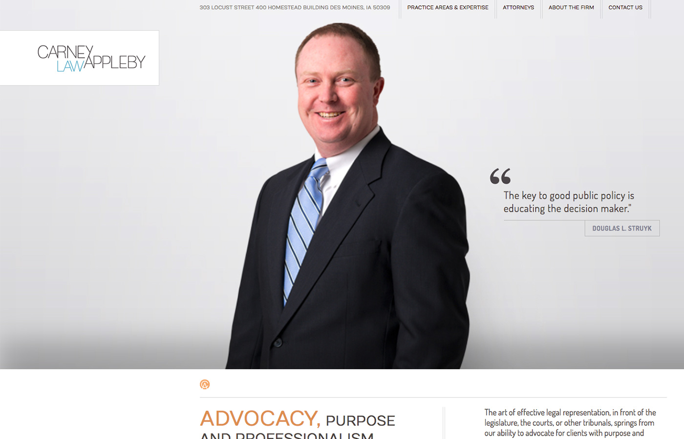
C&A Law is on of the oldest and most influential legal firms in the Midwest. Their goal became to completely revamp their branding and make their new website clean, easy-to-navigate, modern, and mobile-friendly with a focus on their partners and practice fields.
Project Role
UI/UX, Moodboards, Web Design, Front-end Development
Tech Stack
HTML5, JS/jQuery, CSS3, Wordpress, PHP
Duration
3 months

Wireframes and User Experience
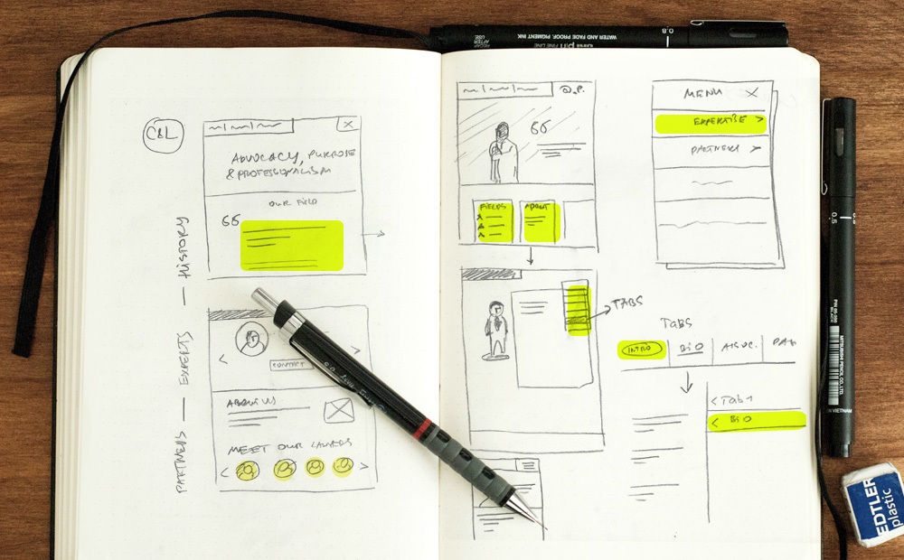
Carney and Appleby has come with a few simple requirements for their new user flow: make it really easy and quick for them to find lawyers, browse between different expertise fields and have obvious contact option. We also knew that they wanted to have predominant partner section. Sketching basic templates and UI was really important in beginning before design phase.
What good is having an imagination if you don't use it?
Responsive Design
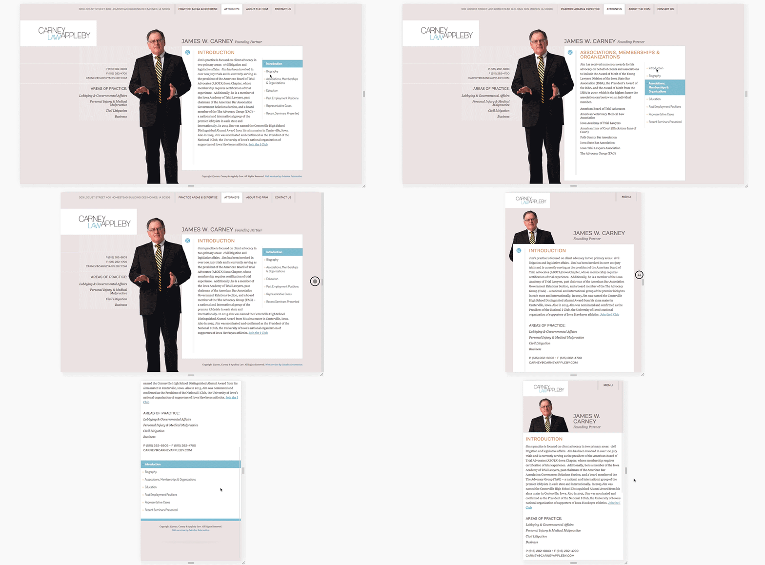
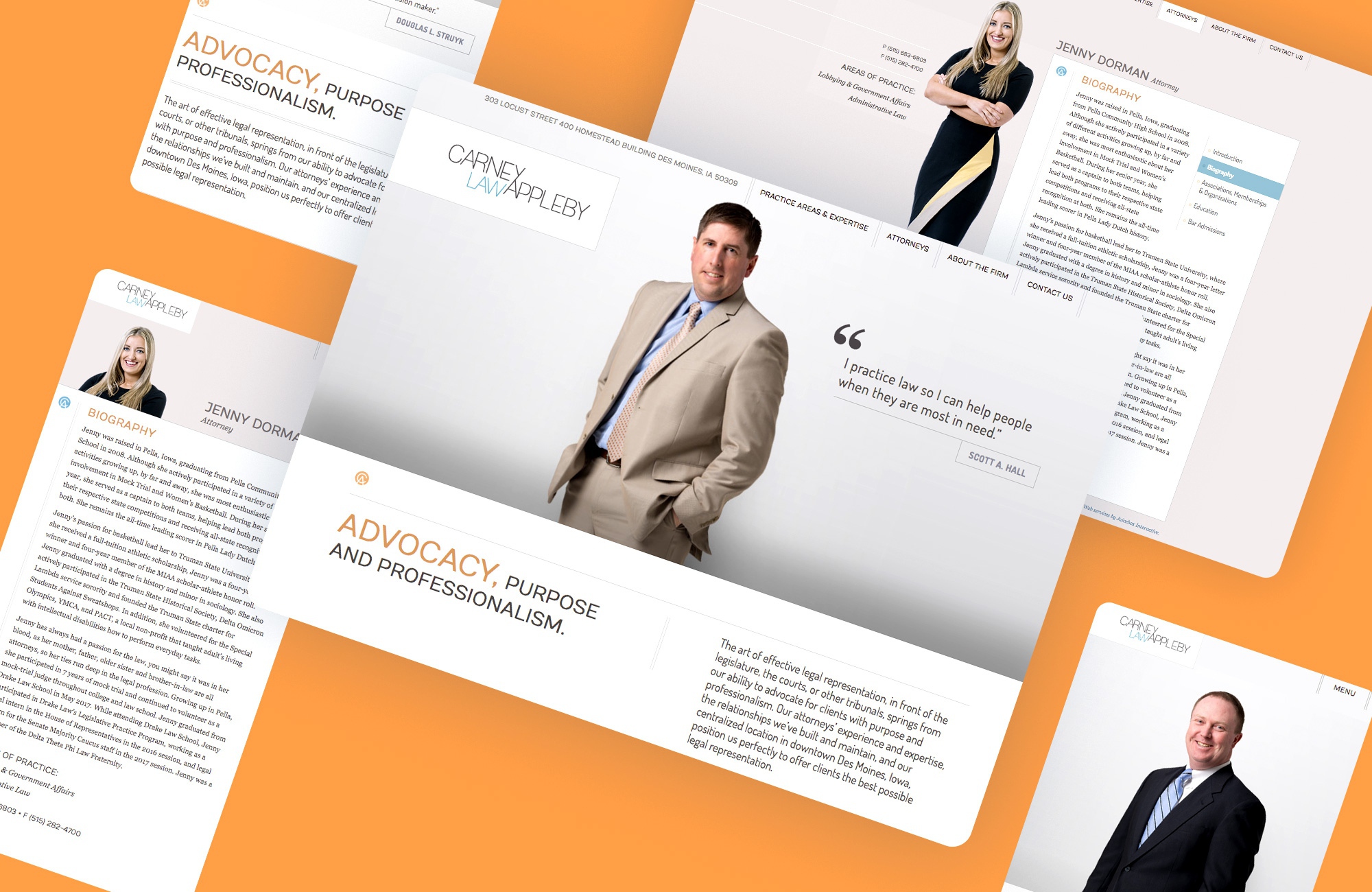
Large part of my work was to build a responsive design on front-end. After realizing how much content each lawyer had to have on their page, for User Experience, I decided to utilize tab navigation on desktop that transitions to collapsible navigation on smaller screens.
