There are a couple of ways that you can promote your business to gain an increase in sales and revenue from existing or possible new customers. For many businesses, email marketing remains to be one of the most powerful options that they tend to utilize. Email marketing allows you to capture a lead, build authority, and then sell to these contacts. It gives you an opportunity to build a relationship – and potentially turn a lead into a returning customer.
When it comes to email marketing and sending out newsletters, you have to ensure people actually open these emails. While this starts with a great subject line, once they open the newsletter, the lead needs to be impressed and find your email to be of value.
There are many different layouts that can be used when sending out newsletters, although some tend to work better than others.
I will share a few examples of successful newsletter designs used in the past. I will also take a quick look at essential things to consider when setting up the layout for your next newsletter.
Successful Newsletter Designs
One of the best ways to improve the success of your own business is to learn from others. I am not saying that you should copy what other companies are doing, but rather use what other brands share as part of their success stories as inspiration as to what they are doing successfully and how.
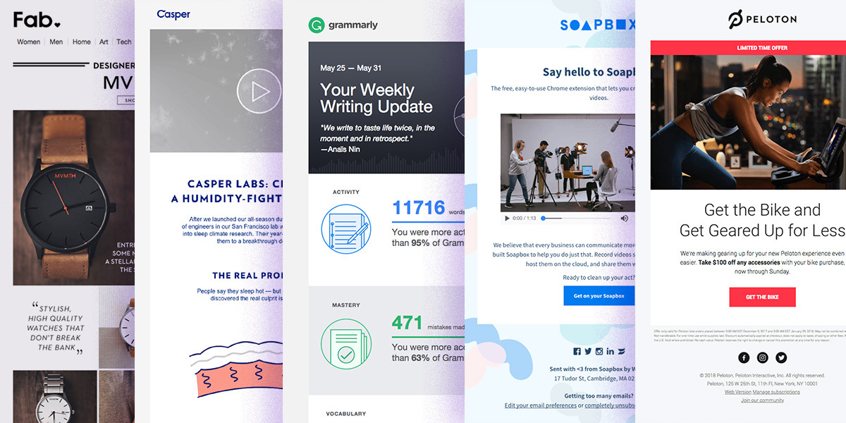
Let's take a look at five excellent email newsletter designs that have previously brought other brands' success. Take a closer look at these and to find inspiration and spark your own creativity.
1. Casper Labs
First up is an email newsletter sent out by Casper Labs. This company specializes in the production of sleeping accessories and other items to help you sleep better. The company recently sent out an email to newsletter subscribers regarding a new Humidity-fighting Duvet.
The email states the humidity and hot blanket problem and tells you how this product solved it. Not too much information, but enough to make an impression of innovative technology that will help you sleep better and more comfortable during the night.
The email is simple and minimalistic but does interactive feature content, including a video that immediately grabs the recipient's attention.

The only critique I have for this email is their CTA at the bottom section is too general. Instead of 'Learn More', they should use 'See How We Solved a Problem' or 'How Our Duvet Works', or 'Buy Our Duvet Now' etc, but something to specify what the user will get when clicking on the button.
2. Peloton
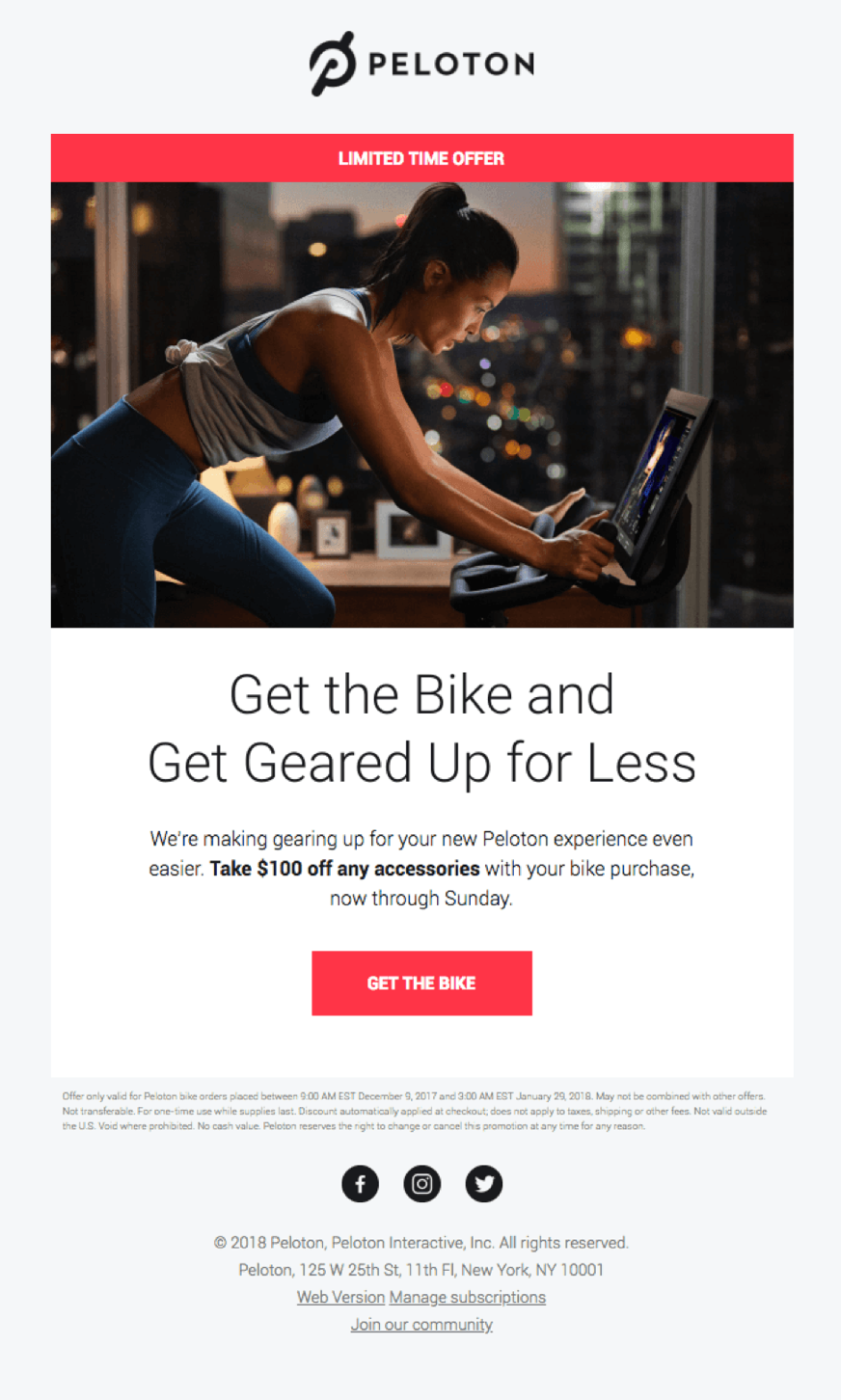
Peleton is a company that sells indoor cycling products. The goal is to give you access to indoor exercise equipment. The company only stocks a range of high-quality products. Peleton recently offered a promotion that gave clients a $100 off any accessories when they buy an indoor bike from the company’s website.
The email had a catchy subject that immediately focused on the goal while also adding some pressure with the line "Last Chance." The subject read: "Last Chance: Get $100 Off Accessories With Your Bike Purchase”.
The design started off by telling the customer that it is a "limited Time Offer." The design was simple, and the CTA was added close to the top.

3. Fab
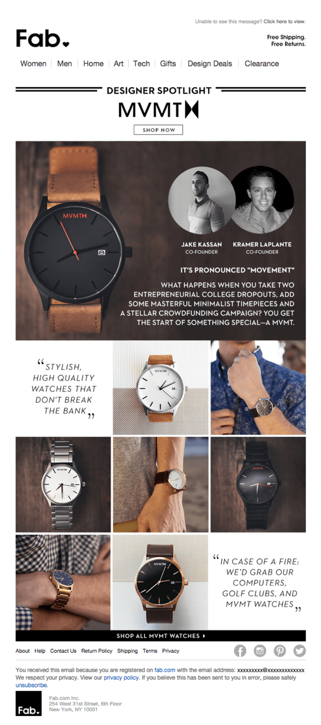
Next up is Fab, a company that focuses on providing customers access to designer brand accessories, art, and even technology products. The company offers free shipping and even provides free returns on selected purchases.
Fab recently expanded its product line by adding a range of MVMT watches to its online catalog. The newsletter was simple, yet provided the customer exactly what they needed to know if they felt interested in getting their hands on an MVMT watch.

4. Grammarly
The world is moving to submit and distributing content on the internet – which makes it easier to ensure punctuation, grammar, spelling, and other factors in published content are all correct. Grammarly is the internet's most popular grammar and spell checker.
Grammarly sends out weekly reports that help you see how many words you checked for the week.

5. Soapbox
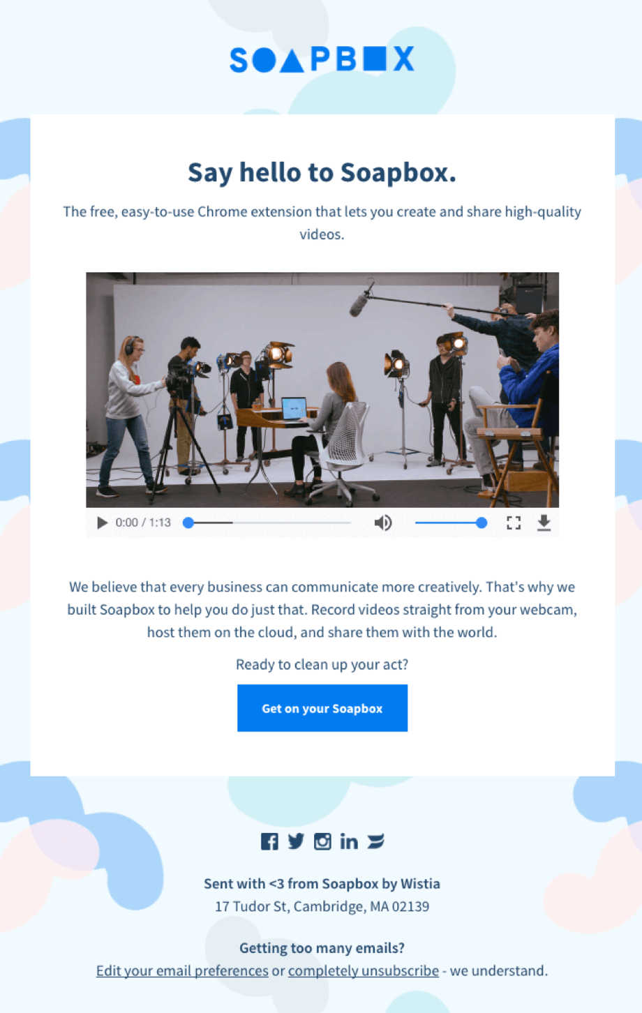
Soapbox also sent out a very attractive, yet minimalistic newsletter that introduces potential users to their new chrome extension. The email contains a video that makes it easier for the recipient to see exactly what the company is offering.
The main thing I love is the personal attention and casual text to get the reader's attention, almost like a conversation, more of asking for a question instead of suggesting to use their product.
"Say Hello ..", "Ready to act?", "Sent with <3 from Soapbox" are all amazing little details that sound personable to their possible customers and they do matter.

Conclusion
Sending out newsletters to your email list is a great way to build authority and trust among your existing customers and invite the new ones to your business.
The possibilities with email newsletter designs are truly endless, however, which can make it hard to come up with a layout that is suitable for your business, newsletter, and audience.
Consider these examples to inspire you during the design of your next email newsletter. My main advice is keep your overall messaging simple, quick to read, use descriptive Call to Actions: instead of Read More, say 'Sign Up for Free Plan' or 'See More of Our Specials' etc. Don't make the design the only thing that will interact with your users but make it as a part of your branding and messaging.